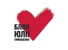
As if this isn't enough, this heart-shaped check thingy also looks like a chalice, the symbol of femininity that Dan Brown's The Da Vinci Code is based around: I realized this back in early December, when I was still at the hospital, reading the book, and Tymoshenko held a gathering at which the new logo was first presented.

I wonder if the guy who created the logo is aware of this additional symbolic layer.
Oh my God, yes! Thanks for reminding me! I noticed it not so long ago myself. Mishah thinks it's a coincidence. Others may or may not be aware, I don't know... I asked my mama - she was surprised, though she does know what 'beauty' means.
ReplyDeleteIt is Beautiful. The check mark looks like a heart to me. It is a feminine shape and a romantic color.
ReplyDeleteThe logo looks quite similar to the logo of Love Radio (except theirs has the shorter side of the heart-like shape on the right side, to suggest a Latin "L"). I didn't have any suspicious thoughts about this, I swear, until, navigiating the Love Radio website to try to find a page with a good example of the logo, I found an interview with none other then Princess Yulia herself - http://www.loveradio.ru/ru/main/lovestory/
ReplyDeleteThe logo is at the bottom left. Note that this url is probably updated with their most recent interviews when they happen, and Tymoshenko happens to be the most recent, so the interview with her may not appear at this url forever.